Covering Spellfall – Katherine Roberts
One of the first things you learn when you self-publish a
book is that writing a story and designing a cover for that story are
completely different skills. Since republishing my backlist as ebooks, I have
certainly felt much more sympathy for my publishers! Because the truth is, getting the right
cover on a book is HARD, and yet it's one of the most important elements in selling that book to its readership. So I thought it might be
interesting to chart the cover history of my book SPELLFALL, for which I am
trying to find a new cover for the ebook edition… at the end of this post I’ll show you some
of the premade covers I'm thinking might work, and since the author is not always the right person to judge I hope you’ll help me decide!

 The Germans picked up on the unicorn ridden by modern children too - I believe the translated title reads "Natalie and the Spell Lords".
 The Americans went down the enchanted world route as well, though they made the unicorn much smaller (he's hiding behind the tree) and focused on the soultree and my heroine
Natalie, who they dressed in a romantic white gown - she does wear a
nightdress at one point in the book. This cover is much more girlie and
romantic, but it worked beautifully for the American market. Sales in the US were good, I understand, and the book was
picked up by the American Independent Booksellers for their “Children’s 76” as
the book most likely to replace Harry Potter that year (the year JK Rowling had a
publishing break in her series).
The Americans went down the enchanted world route as well, though they made the unicorn much smaller (he's hiding behind the tree) and focused on the soultree and my heroine
Natalie, who they dressed in a romantic white gown - she does wear a
nightdress at one point in the book. This cover is much more girlie and
romantic, but it worked beautifully for the American market. Sales in the US were good, I understand, and the book was
picked up by the American Independent Booksellers for their “Children’s 76” as
the book most likely to replace Harry Potter that year (the year JK Rowling had a
publishing break in her series).


 It was by now 2013. I'd been working on my four-book Pendragon Legacy series (published by Templar) and rather neglecting my backlist, but I knew I couldn’t carry on using Chicken House’s cover
forever. Struggling to find a suitable unicorn on zero budget, I decided to
go the DIY route and paint my own. Using pastels, I came up with this cover (left). It turned out rather younger
than I intended, but still has the unicorn and the sparkly bits. I wasn’t very happy with my amateurish painted title, though, so after
discovering www.fontsquirrel.com I tweaked this cover and came up with the version on the right. Since early 2013, with this cover, it's sold
another 100 copies (the financial equivalent of 1,000).
It was by now 2013. I'd been working on my four-book Pendragon Legacy series (published by Templar) and rather neglecting my backlist, but I knew I couldn’t carry on using Chicken House’s cover
forever. Struggling to find a suitable unicorn on zero budget, I decided to
go the DIY route and paint my own. Using pastels, I came up with this cover (left). It turned out rather younger
than I intended, but still has the unicorn and the sparkly bits. I wasn’t very happy with my amateurish painted title, though, so after
discovering www.fontsquirrel.com I tweaked this cover and came up with the version on the right. Since early 2013, with this cover, it's sold
another 100 copies (the financial equivalent of 1,000).
But it's clear Spellfall is underselling. On reflection, I don't think my homemade cover is selling the book to the readership - it’s too young for the book and turned out rather too girly. I also suspect it doesn't work very well for the American market... any Americans out there comment?
It's now 2014, and ebook covers have moved on. The time has come to invest in a more professional look. At my level of sales, custom design is out of my budget, and anyway I don't have a fixed idea of what might excite Spellfall's e-readership today. But recently I've discovered the world of premades, and PREMADES ARE COOL! In fact, I love some of the premade covers out there so much, I almost feel inspired to write a book to match the beautiful covers... but back to Spellfall.
Now it's your turn. Here's my current shortlist (obviously after I've purchased a cover, my title and author name will be inserted instead of the placeholders):
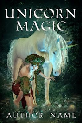 1. Unicorn Magic www.litteradesigns.com
 This one struck me right between the eyes! Even though Natalie is
not a werewolf, she is blonde and her magehound is silver. I think it would work because magehound is her familiar and they have a telepathic link.
This one struck me right between the eyes! Even though Natalie is
not a werewolf, she is blonde and her magehound is silver. I think it would work because magehound is her familiar and they have a telepathic link.

 4. Psychic Energy www.ebookindiecovers.com
Spellfall is an interesting book to cover, since
it contains a lot of different elements. It’s urban fantasy and takes place at
Halloween with covens of Casters (i.e. witches and wizards) living among us. But there’s also a parallel world called Earthaven, accessed through a hole in
a standing stone, where mythical creatures such as unicorns live and where spells
grow on trees. The Casters use these spells, but the supply is strictly
controlled by the Spell Lords of Earthhaven, as the only way of harvesting
new spells is by killing the soultrees they grow on. Naturally, the Spell Lords have set up a spell recycling system to avoid destroying the magic of Earthaven - although the Casters do not care about the trees because they don't live there.
The heroine is Natalie, daughter of a Spell Lady - she has a telepathic white magehound/wolf familiar called K’tanaqui to guide her. She’s the main
viewpoint, so the story has definite girl appeal. But there are also two boy
viewpoints – Natalie’s sulky stepbrother Tim, and a Caster lad called Merlin, who becomes Natalie's friend when she is kidnapped by his father. Merlin's father, Lord Hawk, is the leader of a plot to destroy the soultrees and take control of the resulting spells. The readership is middle grade/teen, and the book's biggest fans in print were 12-14 year old girls.
So already we’ve got:
Fantasy – unicorns, magical trees, a parallel world.
Witches – Halloween, spells, ravens.
Science fiction – organazoomers, soultree root system, spell recycling
Girl and wolf – the magehound is Natalie’s familiar.
Boys – action/thriller plot based around the portal between
worlds.
So what did my publishers make of it?
So what did my publishers make of it?
This was the original cover for Spellfall, back in 2000 when the book
was first published by Chicken House. It picks up on the unicorns that live in Earthaven, and also gives an urban feel with the girl and the boy
riding the unicorn dressed in modern clothes (for 2000). I’d say this cover was
a success. I know I loved it on sight. It was picked up by WH Smith, and went
on to sell almost 25,000 copies in the UK alone.
The Germans picked up on the unicorn ridden by modern children too - I believe the translated title reads "Natalie and the Spell Lords".
Fast forward to 2007, when Chicken House decided to bring
the book back into print and gave it this new more abstract cover that followed
the fashion that year for sparkles on children's books. (You can’t see them here, but this was a paperback and the starry bits glittered.) Originally, this cover was pink… we compromised and ended up with purple. It sold an extra 4,500 copies. Not as good, obviously, but
then the book was backlist and therefore not trendy any more. The unicorn is still there, and the spiral suggests a portal between worlds.
Spellfall went out of print in 2010, and rights reverted to me. Fortunately, that was also the year Amazon opened their kdp
(then the dtp) to UK authors, so I decided my first ebook project would be
Spellfall and begged Chicken House for use of their swirly 2007 cover, because I could see it would work well at thumbnail size. They kindly allowed this, and I published the Spellfall ebook edition in 2011 selling another 150 copies... tiny numbers compared to the thousands it had sold in print, of course, but still worth doing since financially one ebook sale is worth ten print sales to its author, making this the equivalent of selling 1,500 copies via my publisher.
It was by now 2013. I'd been working on my four-book Pendragon Legacy series (published by Templar) and rather neglecting my backlist, but I knew I couldn’t carry on using Chicken House’s cover
forever. Struggling to find a suitable unicorn on zero budget, I decided to
go the DIY route and paint my own. Using pastels, I came up with this cover (left). It turned out rather younger
than I intended, but still has the unicorn and the sparkly bits. I wasn’t very happy with my amateurish painted title, though, so after
discovering www.fontsquirrel.com I tweaked this cover and came up with the version on the right. Since early 2013, with this cover, it's sold
another 100 copies (the financial equivalent of 1,000).But it's clear Spellfall is underselling. On reflection, I don't think my homemade cover is selling the book to the readership - it’s too young for the book and turned out rather too girly. I also suspect it doesn't work very well for the American market... any Americans out there comment?
It's now 2014, and ebook covers have moved on. The time has come to invest in a more professional look. At my level of sales, custom design is out of my budget, and anyway I don't have a fixed idea of what might excite Spellfall's e-readership today. But recently I've discovered the world of premades, and PREMADES ARE COOL! In fact, I love some of the premade covers out there so much, I almost feel inspired to write a book to match the beautiful covers... but back to Spellfall.
Now it's your turn. Here's my current shortlist (obviously after I've purchased a cover, my title and author name will be inserted instead of the placeholders):
A lovely old fashioned one keeping the enchanted unicorn feel. It looks like a boy with the unicorn who could be Merlin, suggests
fallen spells, and has just the right sort of magical feel for a young readership. It doesn’t show the contemporary/thriller side of the book, though - does this matter?
2. Wolf Girl www.sherimcgathy.com
This one struck me right between the eyes! Even though Natalie is
not a werewolf, she is blonde and her magehound is silver. I think it would work because magehound is her familiar and they have a telepathic link.
3. Portal www.magicowldesign.com
This one is good for the parallel world feel, and the woods are suitably
magical. But the girl’s hair is too dark for Natalie and the dog is not really a magehound... however, there is a dog on a leash in the book, which belongs to
Natalie’s best friend Jo, so this could be Jo entering the portal. I think this
cover might work for boys too, since the girl is facing away from us?
4. Psychic Energy www.ebookindiecovers.com
A spooky feel suggestive of the Halloween setting for the book, and has a girl the right age for Natalie. Those are possibly spells falling in the background. I really like the drama of this one.
Which of these would you click on for your child/teenager/yourself? (And, having clicked, would you be expecting a book like Spellfall?)
***
Katherine Roberts won the Branford Boase Award in 2000 for her debut novel Song Quest. She writes fantasy and historical fiction for middle-grade/teen readers. Her latest series is the Pendragon Legacy quartet about King Arthur's daughter (Templar Books). Find out more at www.katherineroberts.co.uk
Comments
I like the unicorn one in the list. Or the portal one. To me it's not about accurately representing the novel's contents, but conveying the feel and "idea" of the book in an image.
I just think they have more character.
Customising the Portal one is certainly an idea.. but I probably won't know where to stop if I go that route, so costs will mount up! Budget will probably be the deciding factor in the end.
Thank you for all the useful feedback.