Your Books Are Cooked! - by Susan Price
Earlier this year, we, the Authors Electric, produced a
collection of pieces called 'Cooking the Books.'
As it was my suggestion, I did most of the production work - compiling the pieces sent to me by the others, formatting it, uploading. Though I should mention the help provided by other Electrics, especially Ruby Barnes, when the formatting all went pear-shaped. The title was supplied by Julia Jones, and the blurb above by Valerie Laws.
As editor for an indie ebook, it fell to me to design the cover. I started out with an idea of having a cooking pot filled with various e-readers. However, I found the task of turning this idea into a useable image quite a struggle.
I have to admit that usually, when doing anything arty on a computer, I rely heavily on help from my brother, Andrew Price, an artist who hardly ever touches a brush these days, using a computer instead. But Andrew, though long-suffering, was busy with his own projects and couldn't spare the time to pull my chestnuts (so to speak) out of the fire. I was also training to be a consultant with the Royal Literary Fund, which was head-nipping, so I'm afraid patience was thin.
I tried taking straight photos of the only e-reader I own, a Kindle Fire, in a saucepan. Didn't really work.
I tried downloading photos from the internet, and making a collage which (I thought) I could then photograph. Didn't work.
Also, my stove is gas. Doesn't work for 'Authors Electric.'
Andrew took pity and said that if I could get some good, high quality photos of an electric hob (ie: not from the web), some pots, and some e-readers, he would merge them in a graphic programme, and produce a final image.
So I appealed to the others for photos. Cally Phillips sent photos of her electric hob (even though she isn't in the anthology - she was too busy republishing the entire catalogue of S R Crockett and running the on-line Edinburgh ebook festival.) Others sent photos of their e-readers. We were all set to produce a image of a pot full of e-readers on a stove.
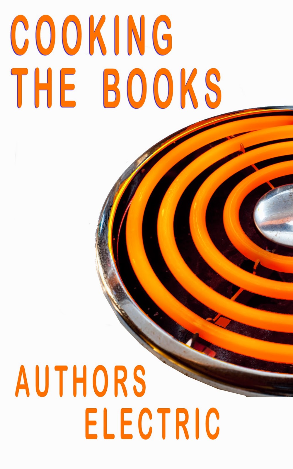
But Andrew asked me to look at a first 'sketch,' to check the placing of the titles - and what I saw was the cover at the top of the blog. White background, glowing orange rings describing part of a circle, and the title and 'Authors Electric.' My reaction was, 'Wow!' I thought it was a simple, uncluttered, powerful image, which would stand out because of its strength and clarity.. The electric rings tied in with 'electric' and with 'cooking.' I called a halt. I said, never mind about pots and e-readers - we'll go with that one.
Because I was pressed for time, I was autocratic about it. I said, this is what I've decided on: this is the cover the book is getting.
So the ebook was published, and all was quiet for a while.
And then, this week, Kathleen Jones was forced to unclench
the gritted teeth at last, and admit that she hated those electric rings. They reminded her, she said, of years of domesticity, of the slog of preparing meals every day. One or two of the others then piped up and said that they felt the same.
Now this took me by surprise, I admit. Not by the fact that some people didn't like the cover - you're never going to please everybody, all the time, no matter how hard you try, and for 28 people to all feel the same degree of liking for something would be a miracle.
No, what surprised me was how the image was interpreted: domesticity, drudge, slog, frustration, boredom...
Whereas my interpretation (and the reason I chose the image) is: electricity, power, heat, simplicity, directness...
Neither of these interpretations is wrong. The difference lies in the experiences of the mind making the connections. I'm very undomesticated. It's never been my lot to produce meals, day after day, year after year - so I don't make that reaction to the image. If I cook, it's usually for myself. If I don't want to cook, I don't.
So the point of this blog is that, when coming up with your ebook cover, there's a lot to think about besides whether you not you, personally, like it. Quite without your knowing it, the cover image may be sending out a message that you didn't intend at all.
This, of course, is why publishers and product manufacturers, spend a lot of time and money on testing covers and packaging. Cleaning products, for instance, tend to be packaged in bright, 'clean' colours because darker colours - though they would stand out among all the others on the shelf - suggest 'grubbiness.'
Anyhow, comes the hour, comes the woman. Chris Longmuir, crime-writer and techie, stepped up and said she would design a new cover, along the lines first suggested. Here's her first, trial run, which I think is great stuff, considering that she was having to teach herself new skills as she went along.

Some tweaks have been suggested. Some people don't like 'Authors Electric' being staggered - they want it centred. Someone suggested that the wooden spoon be removed.
I'm lobbying for a light background, as I know designers are mad about 'white space,' and I think many people may, at first glance, assume something sinister is going on in this book.

Any thoughts? - On this cover, or on covers generally?
 |
| Cooking the Books by Authors Electric |
Tasty treats and unusual eats from Authors Electric blogging collective!...Here’s a chance to cook from our books with e-readable recipes, or just get the not-so-skinny on what keeps authors stoked while they scribble: some of it yummy, some of it funny. An ebook to binge or snack on, where the calories are certified virtual. Dig in!
As it was my suggestion, I did most of the production work - compiling the pieces sent to me by the others, formatting it, uploading. Though I should mention the help provided by other Electrics, especially Ruby Barnes, when the formatting all went pear-shaped. The title was supplied by Julia Jones, and the blurb above by Valerie Laws.
As editor for an indie ebook, it fell to me to design the cover. I started out with an idea of having a cooking pot filled with various e-readers. However, I found the task of turning this idea into a useable image quite a struggle.
 |
| Andrew's work... |
I tried taking straight photos of the only e-reader I own, a Kindle Fire, in a saucepan. Didn't really work.
I tried downloading photos from the internet, and making a collage which (I thought) I could then photograph. Didn't work.
Also, my stove is gas. Doesn't work for 'Authors Electric.'
Andrew took pity and said that if I could get some good, high quality photos of an electric hob (ie: not from the web), some pots, and some e-readers, he would merge them in a graphic programme, and produce a final image.
So I appealed to the others for photos. Cally Phillips sent photos of her electric hob (even though she isn't in the anthology - she was too busy republishing the entire catalogue of S R Crockett and running the on-line Edinburgh ebook festival.) Others sent photos of their e-readers. We were all set to produce a image of a pot full of e-readers on a stove.
But Andrew asked me to look at a first 'sketch,' to check the placing of the titles - and what I saw was the cover at the top of the blog. White background, glowing orange rings describing part of a circle, and the title and 'Authors Electric.' My reaction was, 'Wow!' I thought it was a simple, uncluttered, powerful image, which would stand out because of its strength and clarity.. The electric rings tied in with 'electric' and with 'cooking.' I called a halt. I said, never mind about pots and e-readers - we'll go with that one.
Because I was pressed for time, I was autocratic about it. I said, this is what I've decided on: this is the cover the book is getting.
So the ebook was published, and all was quiet for a while.
And then, this week, Kathleen Jones was forced to unclench
 |
| Kathleen Jones |
Now this took me by surprise, I admit. Not by the fact that some people didn't like the cover - you're never going to please everybody, all the time, no matter how hard you try, and for 28 people to all feel the same degree of liking for something would be a miracle.
No, what surprised me was how the image was interpreted: domesticity, drudge, slog, frustration, boredom...
Whereas my interpretation (and the reason I chose the image) is: electricity, power, heat, simplicity, directness...
Neither of these interpretations is wrong. The difference lies in the experiences of the mind making the connections. I'm very undomesticated. It's never been my lot to produce meals, day after day, year after year - so I don't make that reaction to the image. If I cook, it's usually for myself. If I don't want to cook, I don't.
So the point of this blog is that, when coming up with your ebook cover, there's a lot to think about besides whether you not you, personally, like it. Quite without your knowing it, the cover image may be sending out a message that you didn't intend at all.
This, of course, is why publishers and product manufacturers, spend a lot of time and money on testing covers and packaging. Cleaning products, for instance, tend to be packaged in bright, 'clean' colours because darker colours - though they would stand out among all the others on the shelf - suggest 'grubbiness.'
Anyhow, comes the hour, comes the woman. Chris Longmuir, crime-writer and techie, stepped up and said she would design a new cover, along the lines first suggested. Here's her first, trial run, which I think is great stuff, considering that she was having to teach herself new skills as she went along.
Some tweaks have been suggested. Some people don't like 'Authors Electric' being staggered - they want it centred. Someone suggested that the wooden spoon be removed.
I'm lobbying for a light background, as I know designers are mad about 'white space,' and I think many people may, at first glance, assume something sinister is going on in this book.
Any thoughts? - On this cover, or on covers generally?
Comments
Get a professional on to it!
This all shows just how difficult it is to get a cover right, and how difficult it is to achieve the right result - thanks for an interesting post Sue, and Chris for producing something which looks pretty good!
I do agree with Dennis that if you decide to go with one of these covers, the black background is more effective - more dramatic.
Nick has used a professional artist who doesn't charge very much at all, and this may be a possibility. I'm sure Nick is happy to provide a link.
Every morning before starting in on writing, I go through a warming-up routine which includes reading a page or two from Fletcher's wonderful (& hefty) collection about design, The Art of Looking Sideways. This is what I happened to turn to today: 'Good design is good business.' (Thomas Watson Jr, IBM Chairman 1961-1971). Steve Jobs would likely have agreed.
My point? To whom are you marketing Cooking the Books? Just yourselves? Or do you see it as a way of presenting AE writers to the general public? If the latter, maybe the expense of a professional cover is worth a small contribution from everyone.
If anyone wants me to contact my tame designers, I'm happy to oblige. It wouldn't cost the Collective anything.