Paperback cover design for a fantasy trilogy - Katherine Roberts
This summer, I've been preparing my Echorium trilogy for the print on demand editions, following the reversion (for the third time) of print rights for the award-winning first title in the series SONG QUEST, which has been pretty much in print since its first publication in 1999.
Here are the previous three editions:
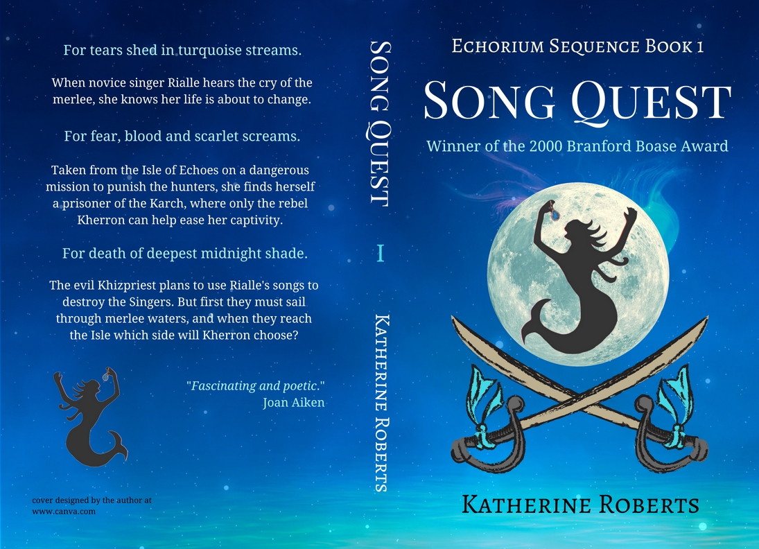
Note the recurring ship-and-mermaid theme? Well, both the ship and mermaids are definitely part of the story - although I also have male 'merlee' in my books (I've always struggled with the idea of mermaids perpetuating the species without any males around... how does that work?) Three different publishers can't be wrong, so my covers would obviously need:
Mermaid(s).
Sea... and why not go underwater for a change?
I also wanted my covers to suggest the series' epic fantasy element, and apparently that comes down to having one of three things:
- sword
- shield
- dragon.
Dragons were not appropriate, since I have various half creatures - half human, half animal - in my books instead. I tried a shield as the background to my mermaid silhouette but it looked too fussy, so I decided on the shield-like shape of the full moon instead. I added two crossed swords for the fantasy element and a sprinkling of stars (to tie in with the other two books, which both feature half-creatures that would drown underwater), and came up with this:
Obviously, the other two covers needed to look vaguely like the same series, so I kept the basic design and swapped the silhouettes. Book 2 CRYSTAL MASK features centaurs (half horse, half human):
Whereas Book 3 DARK QUETZAL features quetzals (half bird, half human):
Hmm... wait a moment. Quetzal, tick. Swords, tick. I love orange books, and the text is easy to read. But why is the moon rising in front of the mountains? And where is the forest where the quetzals live? And does this cover really suggest 'dark' to you? I wasn't so sure about this one when I saw it alongside the other two. So I tried again:
I'm still not quite sure how this one will print. The stars are rather fizzy but appropriate, and the darker colour seems to go better with the other two covers. If it looks rubbish when the proof arrives, I can always go back to the yellow one, perhaps tweaked a bit so the moon is actually in the sky... that's the beauty of print on demand.
To create these paperback covers, I used my favourite design software Canva www.canva.com, which provided the backgrounds and the moon picture free of charge. The half creatures are my own artwork - I turned my originals into transparencies using pixlr.com. The crossed swords cost me a total of $4 (should have been $3 for three uses, but I redesigned the Dark Quetzal cover after my 24 hour one-time use licence period had passed, in preference to staying up all night to work on it.)
If you need more detail, see my previous cover design tutorial for Createspace:
https://authorselectric.blogspot.com/2016/11/cheapfree-paperback-covers-for.html
I'm still proofing the new editions of the Echorium books, so it will be a few weeks yet before you can order these print on demand paperbacks. In the meantime, all three titles are available as ebooks for Kindle:
Song Quest
Crystal Mask
Dark Quetzal
and also for epub from Apple/Kobo/Nook - see my website for all the links.
 Katherine Roberts writes fantasy and historical fiction for young (and older) readers. Her debut Song Quest won the 2000 Branford Boase Award in the UK, and was published by Scholastic in the US. Her latest title is Bone Music, published by Greystones Press.
Explore Katherine's books at
Here are the previous three editions:
 |
| Element Books 1999 |
 |
| Chicken House 2001 |
 |
| Catnip 2012 |
Mermaid(s).
Sea... and why not go underwater for a change?
I also wanted my covers to suggest the series' epic fantasy element, and apparently that comes down to having one of three things:
- sword
- shield
- dragon.
Dragons were not appropriate, since I have various half creatures - half human, half animal - in my books instead. I tried a shield as the background to my mermaid silhouette but it looked too fussy, so I decided on the shield-like shape of the full moon instead. I added two crossed swords for the fantasy element and a sprinkling of stars (to tie in with the other two books, which both feature half-creatures that would drown underwater), and came up with this:
 |
| Song Quest - print on demand edition |
Obviously, the other two covers needed to look vaguely like the same series, so I kept the basic design and swapped the silhouettes. Book 2 CRYSTAL MASK features centaurs (half horse, half human):
 |
| Crystal Mask - print on demand edition |
Whereas Book 3 DARK QUETZAL features quetzals (half bird, half human):
 |
| Dark Quetzal - attempt 1 |
Hmm... wait a moment. Quetzal, tick. Swords, tick. I love orange books, and the text is easy to read. But why is the moon rising in front of the mountains? And where is the forest where the quetzals live? And does this cover really suggest 'dark' to you? I wasn't so sure about this one when I saw it alongside the other two. So I tried again:
 |
| Dark Quetzal - attempt 2 |
I'm still not quite sure how this one will print. The stars are rather fizzy but appropriate, and the darker colour seems to go better with the other two covers. If it looks rubbish when the proof arrives, I can always go back to the yellow one, perhaps tweaked a bit so the moon is actually in the sky... that's the beauty of print on demand.
To create these paperback covers, I used my favourite design software Canva www.canva.com, which provided the backgrounds and the moon picture free of charge. The half creatures are my own artwork - I turned my originals into transparencies using pixlr.com. The crossed swords cost me a total of $4 (should have been $3 for three uses, but I redesigned the Dark Quetzal cover after my 24 hour one-time use licence period had passed, in preference to staying up all night to work on it.)
If you need more detail, see my previous cover design tutorial for Createspace:
https://authorselectric.blogspot.com/2016/11/cheapfree-paperback-covers-for.html
I'm still proofing the new editions of the Echorium books, so it will be a few weeks yet before you can order these print on demand paperbacks. In the meantime, all three titles are available as ebooks for Kindle:
Song Quest
Crystal Mask
Dark Quetzal
and also for epub from Apple/Kobo/Nook - see my website for all the links.
*

Explore Katherine's books at
Comments
Still wondering a bit about the Quetzal cover (which is very starry on the back, making the blurb harder to read), but glad I didn't go for the yellow one now that I've seen the three books together. My theory is that the blurb on the back is less important with a print-on-demand title than it would be for a book in a bookshop... what are your thoughts on that?